Climaxes
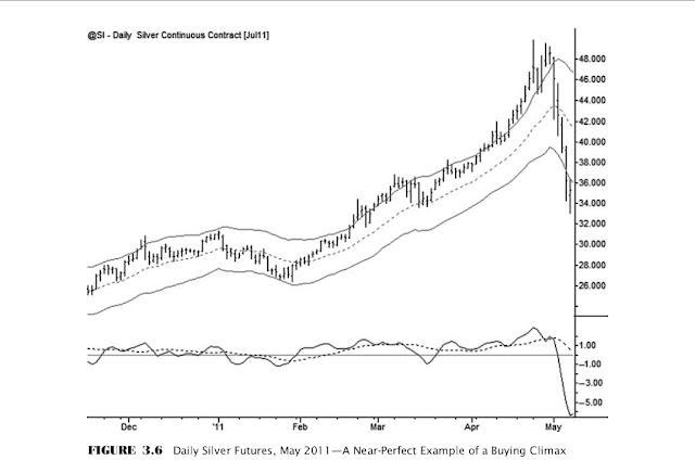
Buy pullbacks following an upward impulse move, or short bounces after strong selling impulse moves. That, in a nutshell, is a very effective plan for trading trends. Simple, right? Not so fast—there is a potential complication, and it is one of the most significant problems in technical analysis. It is true that there should be follow-through (range expansion) in the direction of previous impulse moves; however, extremely strong impulse
was clear. A climax, by itself, is probably not enough information to justify assuming a countertrend position (though it does have the advantage of defining a clear risk point), but it should at least put trend traders on notice. Do not enter pullbacks following potential climaxes. Notice that these examples have come after extended, mature trend runs; a potential climax out of a trading range is much more problematic. Climactic conditions can be defined only by their proportional relationship to recent market history. Volatility contracts greatly in ranges, so any indicators measuring range expansion will also be skewed—in other words, it takes a much smaller movement to make a climax pattern on a breakout of a range. Furthermore, strong breakouts of ranges, even if they are apparently climactic, usually see continuation, so these are difficult trades, and it is probably best to look for climaxes only after extended trends. Figure 3.8 shows the Dow Jones Industrial Average (cash index) in the days following the terrorist attacks on the World Trade Center on September 11, 2001. Even in this exceptional example, with several days on which the stock market did not trade due to the uncertainty following the attacks, the patterns of climax and exhaustion are consistent. Markets move in response to emotion; robust technical tools quantify
those movements and underlying emotions in ways that make them consistently readable, even in extreme examples. This chart captured a time of great turmoil, but even so, the climax pattern is familiar: large ranges, parabolic expansion outside the bands, many free bars (highs below the lower band), and many large bars that close on their low. In this case, there was no clear upside momentum following the climax, but the selling climax should at least have been a warning to traders not to short into the following pullback. In this case, the extreme reached in mid-September held as the low for over a year. Speaking of extreme situations, Figure 3.9 shows the Dow Jones Industrial Average as it behaved during the crash of 1929. The patterns are essentially the same as we see in any other climax situation, and the geometric relationships of the market to the moving average and the channels are consistent with anything we would see in modern markets. One of the challenges thrown up against technical analysis is that many authors claim it is a self-fulfilling prophecy, as many traders are using the same tools and making the same decisions. While this is completely rational, it is a flimsy argument because many technical tools and patterns work on periods of market history where no one was using
them. No one in 1929 was using exponential moving averages or Keltner channels, yet they would have been reliable tools. This is food for thought. There is another point here, concerning expectations from technical patterns. Neither this 1929 climax low nor the 2001 climax low marked the ultimate low for the market. In both cases the low was retested several times and failed to hold, albeit after the market put in a substantial bounce. Do not assume that these climax patterns are necessarily justification to assume a countertrend position, but do use them as warnings to lighten up or exit existing with-trend positions. Climax patterns are important and can be extremely dangerous to traders who do not understand how they work. We will revisit this structure several times and consider specific trading patterns that can set up around them, but the key, for now, is that you can identify the characteristic patterns of climaxes on charts and know to avoid getting caught in the mania or the panic of the crowd. It is not possible to identify these areas with 100 percent accuracy, and it is not always possible to separate climactic moves from simple strength or weakness that should see continuation. Sometimes you will misjudge and make the wrong decision; this is unavoidable, but be sensitive and responsive to this potential error and make adjustments as soon as possible. Do not trade in the direction of blow-off climaxes. To review, some of the most important characteristics of these areas are that they:
- Usually come after two or more trend legs in the same direction.
- Show an acceleration in the direction of the previous trend. Many analysts and traders describe this as a market that has gone parabolic.
- Are relatively infrequent. Usually come at a significant new high or low for the time frame being considered. It is unusual to see climax moves in the middle of a range.
- Are confirmed by the emergence of sharp contratrend momentum. If this does not happen, the trend might simply be very strong.
- Vary in significance. Small exhaustions into previous support and resistance are common, especially on lower time frames, and may not define important structural points for the market on higher time frames.


